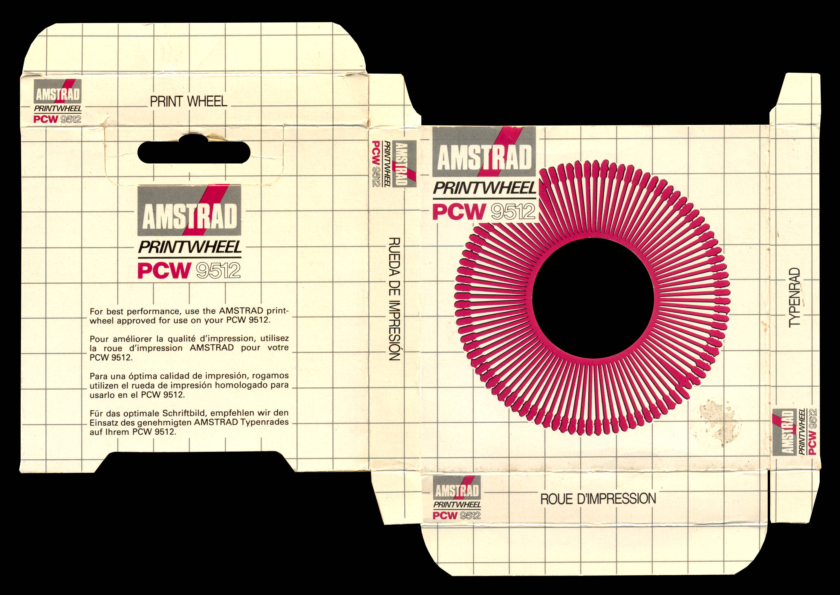
Different printwheels with fonts for the daisywheel printer of the PCW 9512 are shown here.
en:hardware:daisy_wheels
¡Esta es una revisión vieja del documento!
A> PRINTWHEELS
Packaging
Fonts
Some of the different printwheels for the Amstrad PCW 9512 daisywheel printer are shown below.
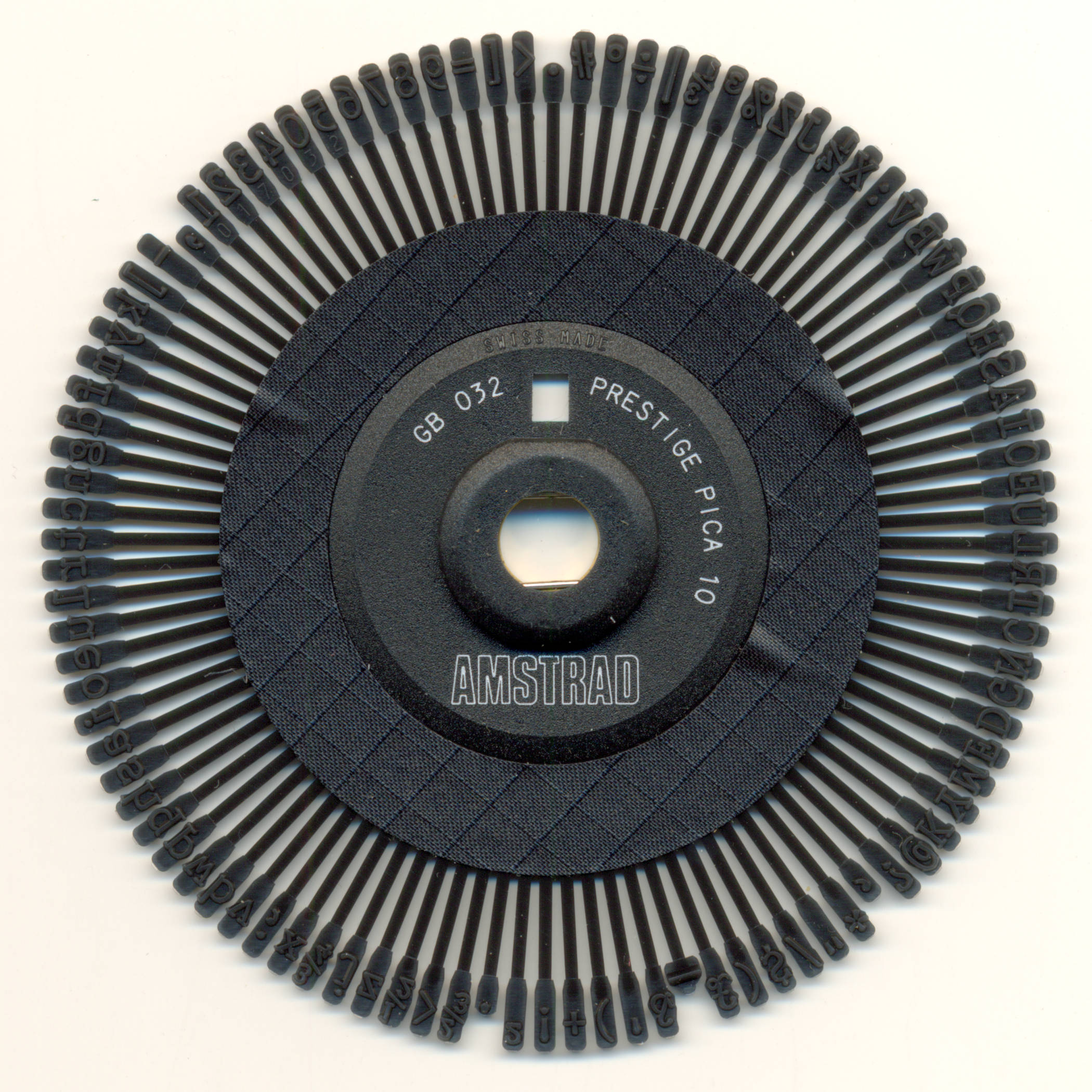
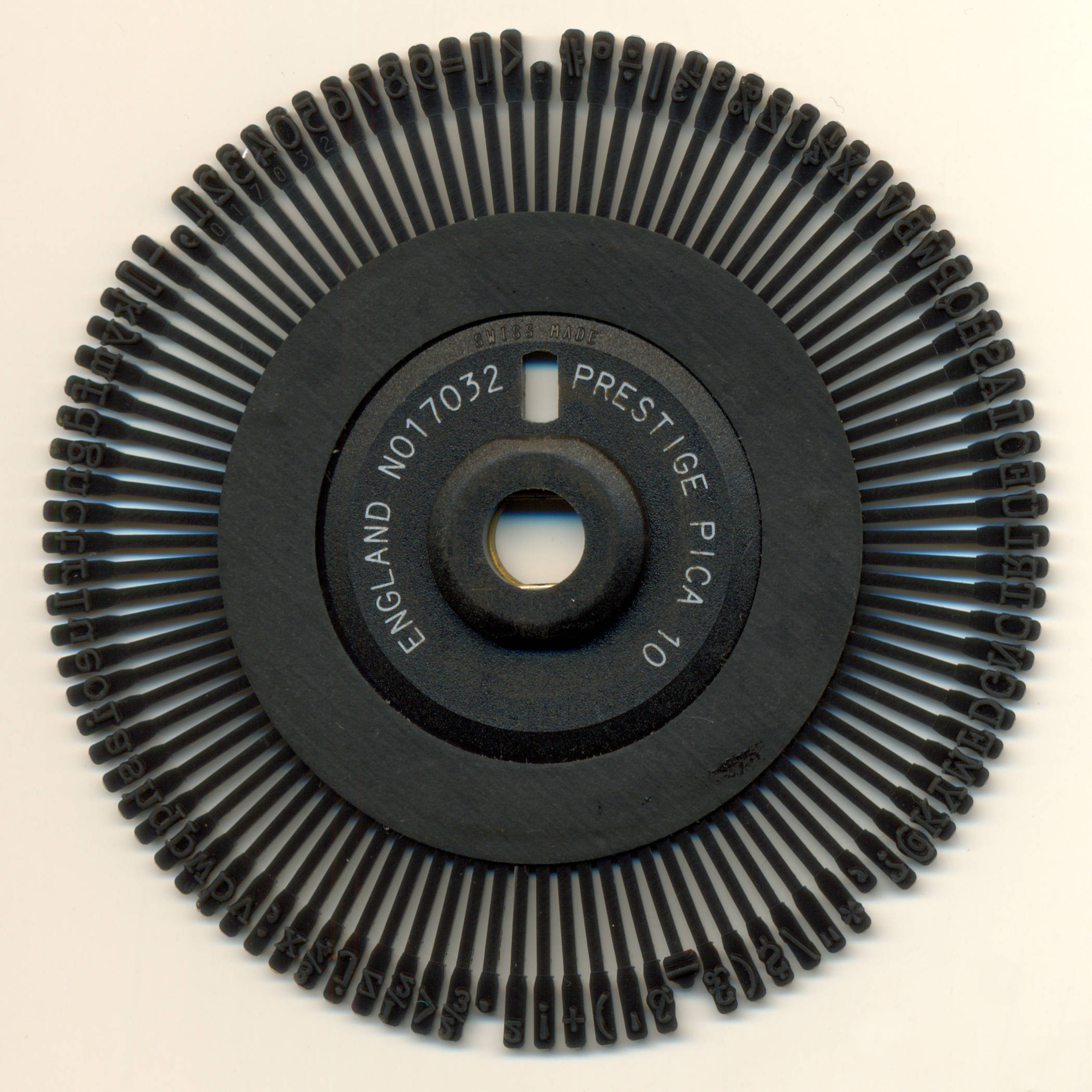
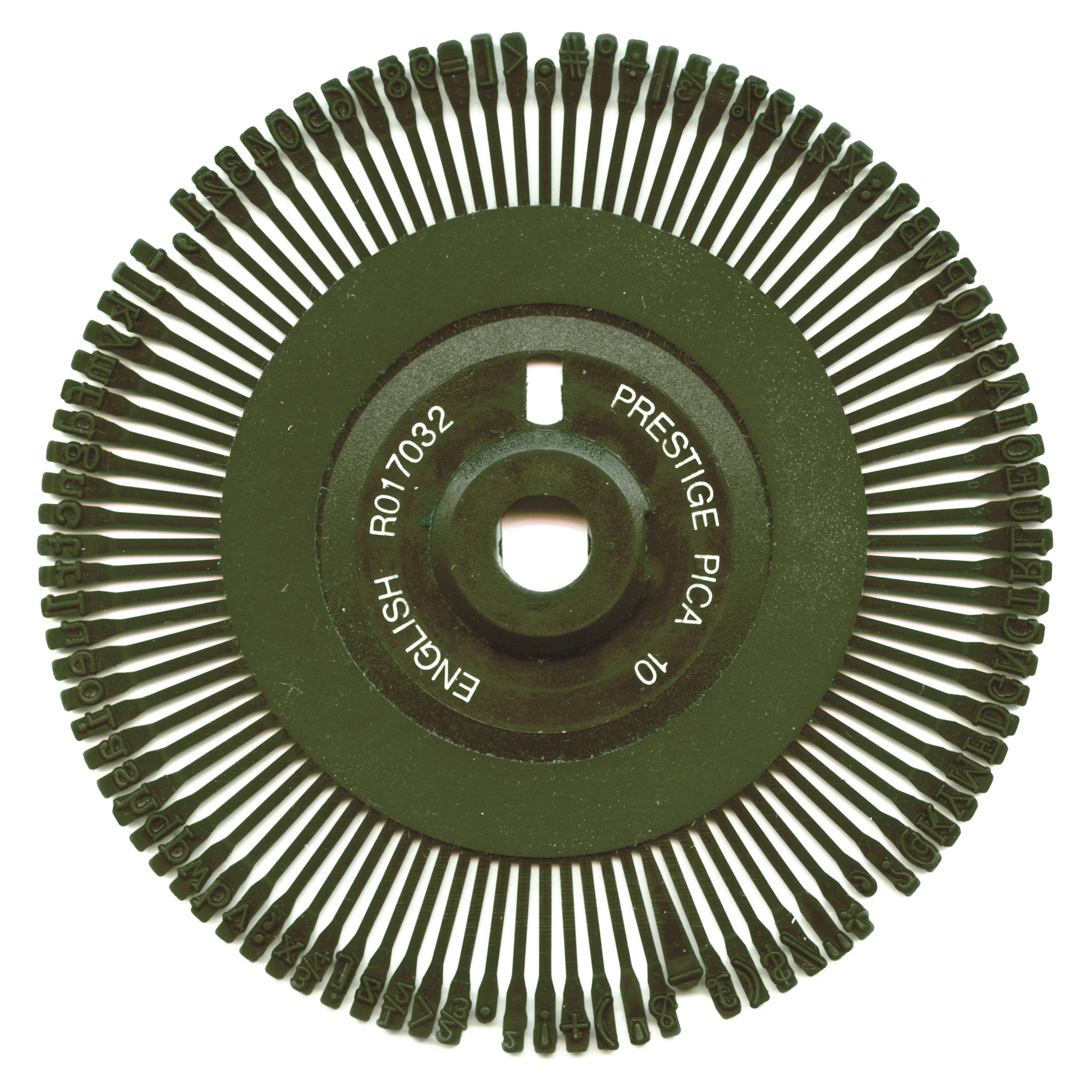
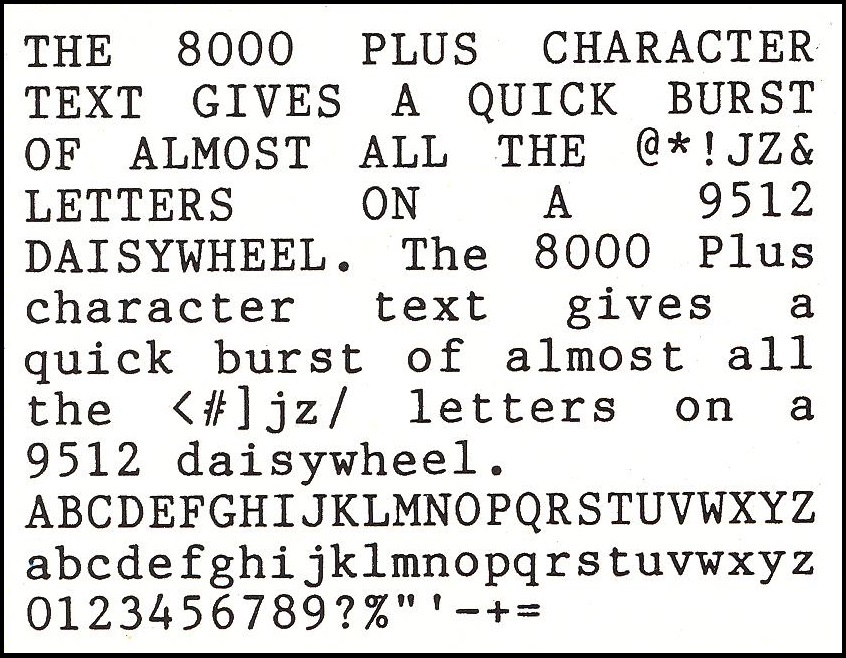
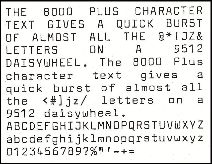
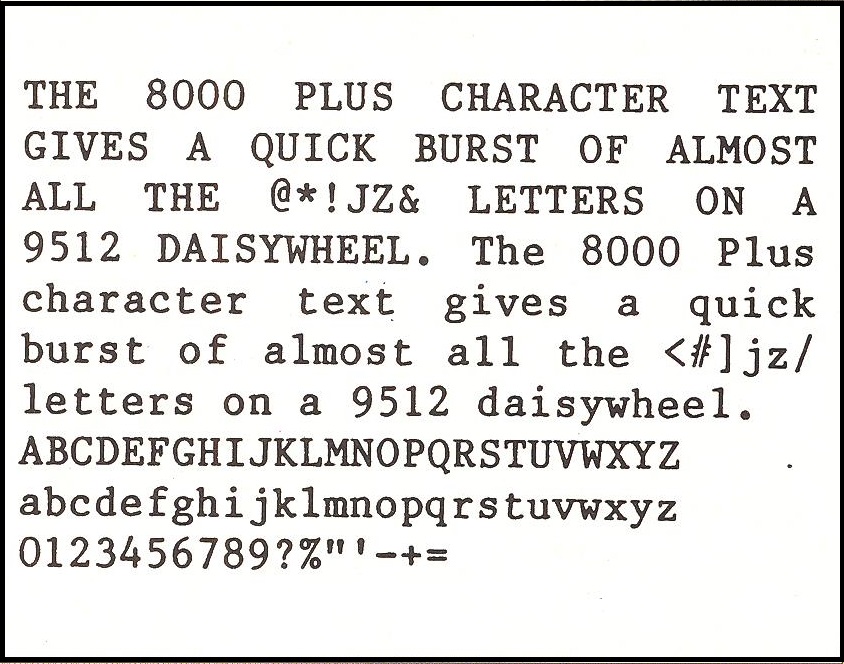
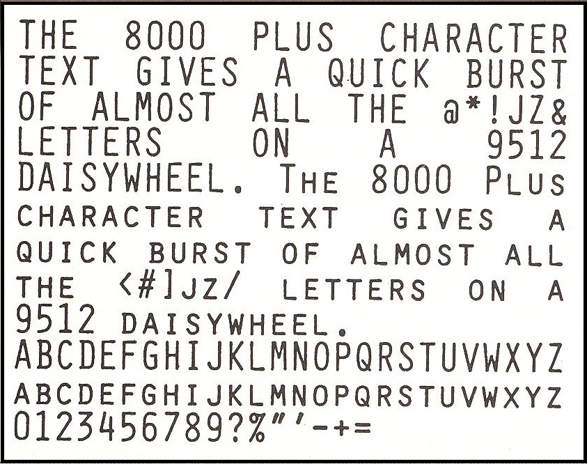
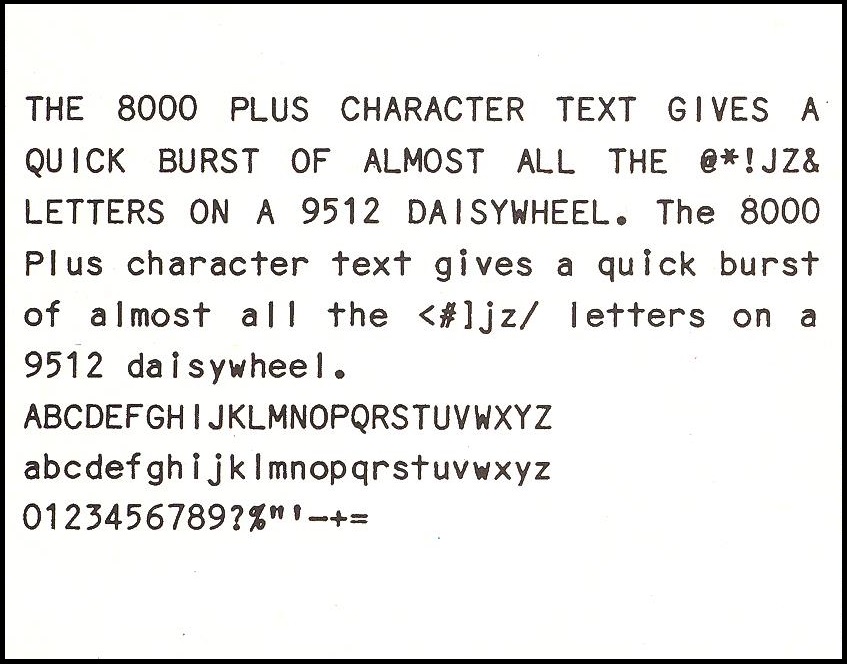
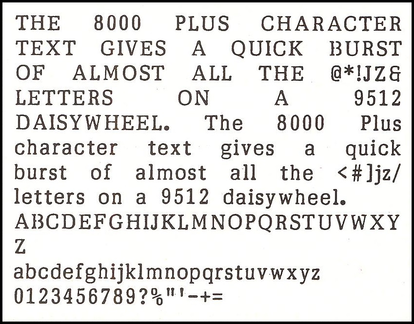
Prestige Pica 10
English (The existence of Italian, French, and Spanish versions is known)
The standard wheel included with the 9512 printer. It gives good, strong letters in all aspects. If you wish to experiment with the basic 10-pitch format, try 10 D (the D stands for 'Double space') for emphasis, or 12 or PS to cluster the letters. The effects are interesting and surprisingly good.
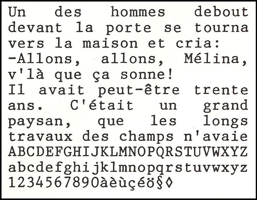
French
On this wheel, there are the accents you would expect, as well as some rather unexpected characters. A curious omission is the "double guillemet" speech marks often used on the continent. Although we illustrate Prestige Pica 10, French wheels are available in all other styles.
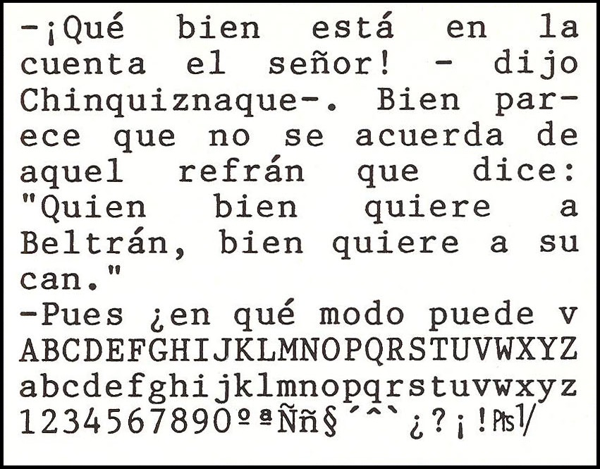
Spanish
The question marks and exclamation marks are not only in the correct position, but also upside down! Again a full range of signs and accents, including the peseta symbol. As with most European wheels, the basic characters are like those on English wheels; only the special characters differ, this extract shows a text by Cervantes.
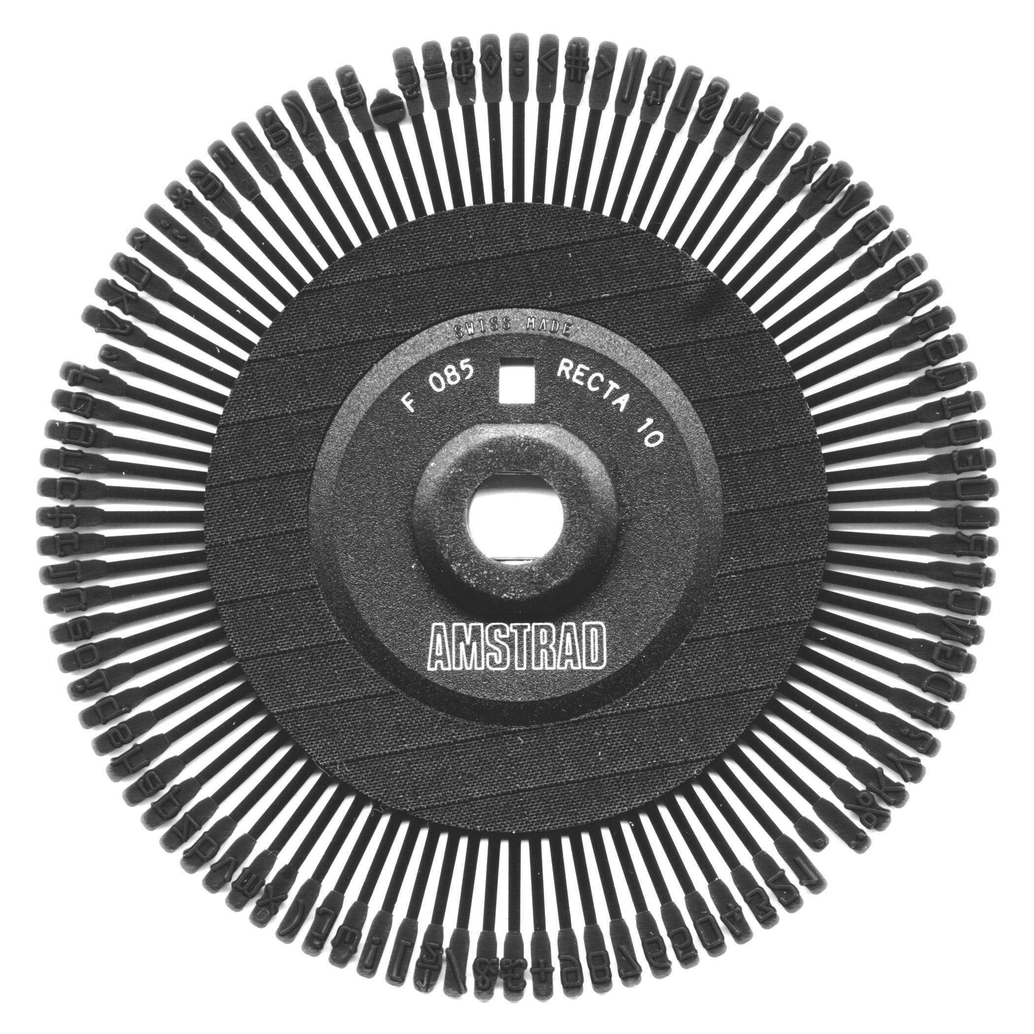
Recta 10
English
An expensive typewriter face. Its characters are squarer than most, but at the same time the lines are slightly wiry. All this means that it provides plenty of breathing space, and the effect is light and airy. This makes it an ideal style for personal letters. Bold print in this script looks horrible.
Belgian
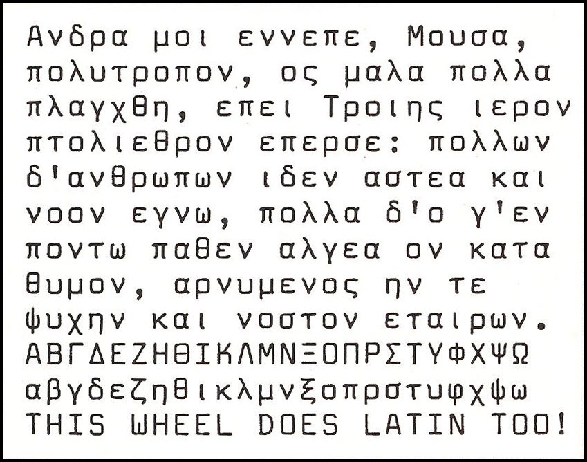
Greek Latin
3 Greek wheels are available, with pitch 10 and 15. Unfortunately none of them are PS wheels, which is a pity since Recta 10 seems to leave plenty of space between the letters. Most accents are available. In addition to Greek letters, there is a set of capital letters.
The Printer Support Pack manual suggests that Greek Latin wheels cannot be used with CP/M. In fact, the wheels are exactly the same as the others, so they fit in the printer and will work, regardless of the software you are running. Once it is physically in place, with the correct pitch spacing selected, you will have to experiment to see which characters on the screen activate which characters on the wheel. You might end up with gibberish in your computer file, but your printout should be fine.
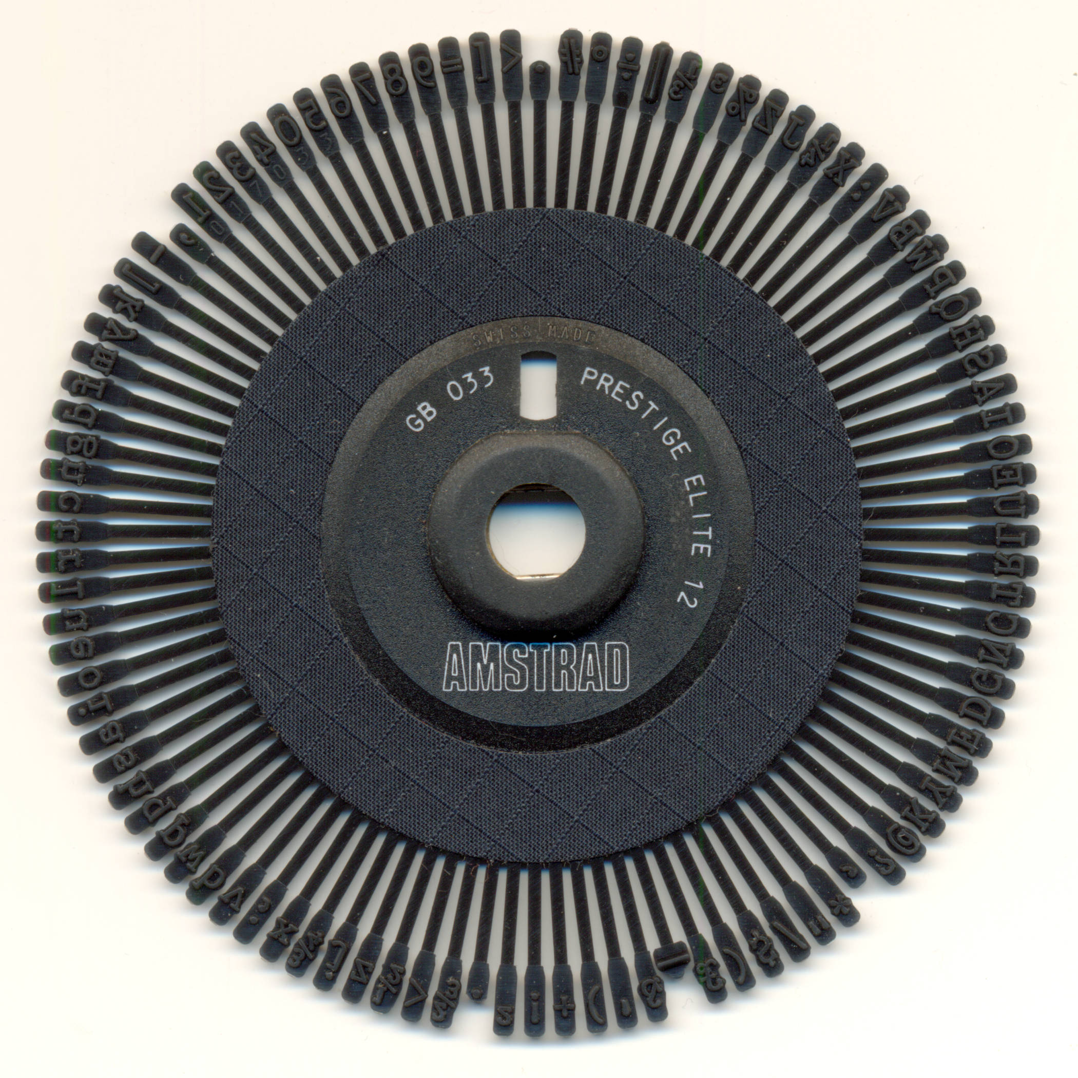
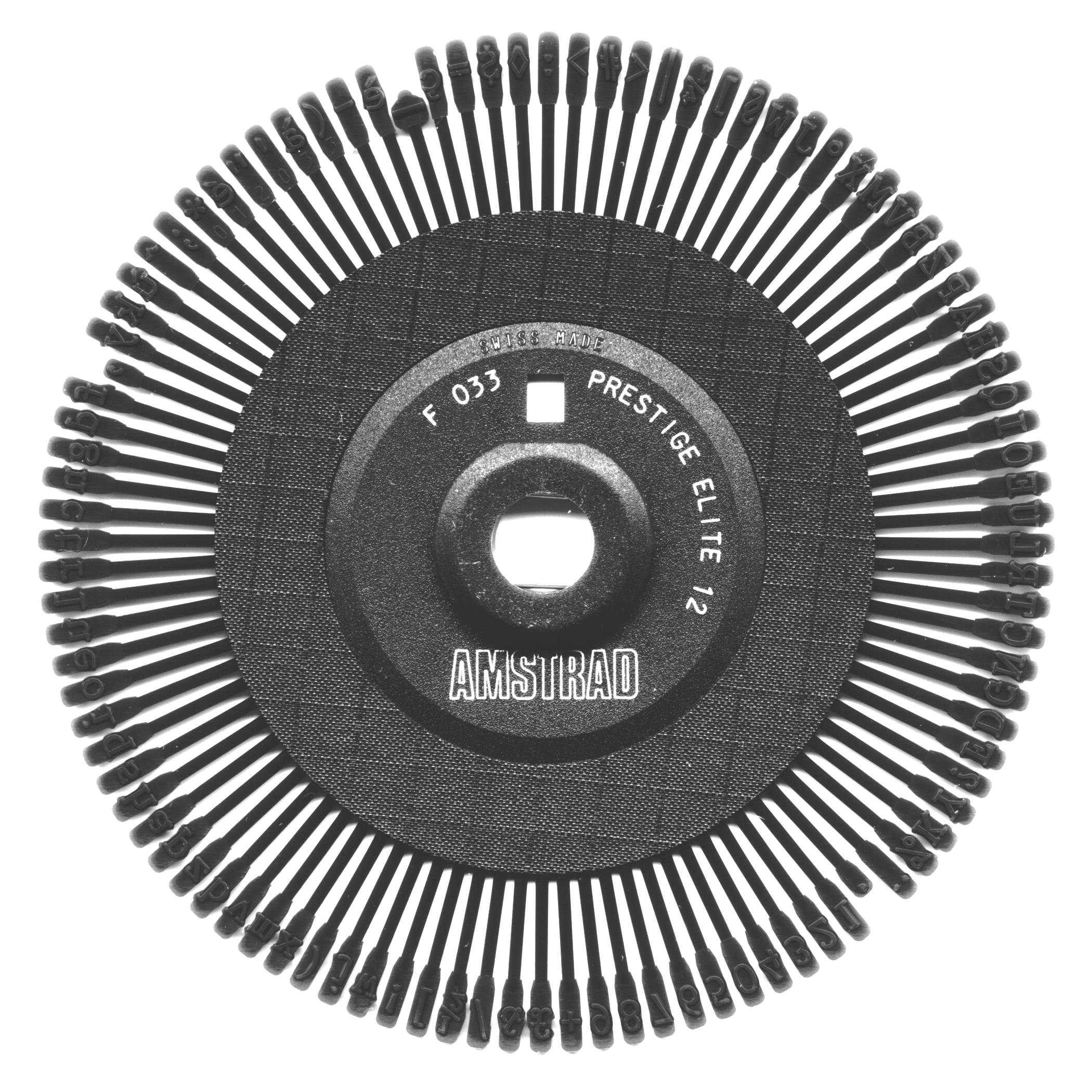
Prestige Elite 12
English
Belgian
A smaller version of Prestige Pica 10. Note the effect on the document when reducing the pitch to 12: we changed nothing in the document, other than the pitch setting and the wheel. Because the text is more closely spaced, the overall effect is a darker page, especially if it is full of text.
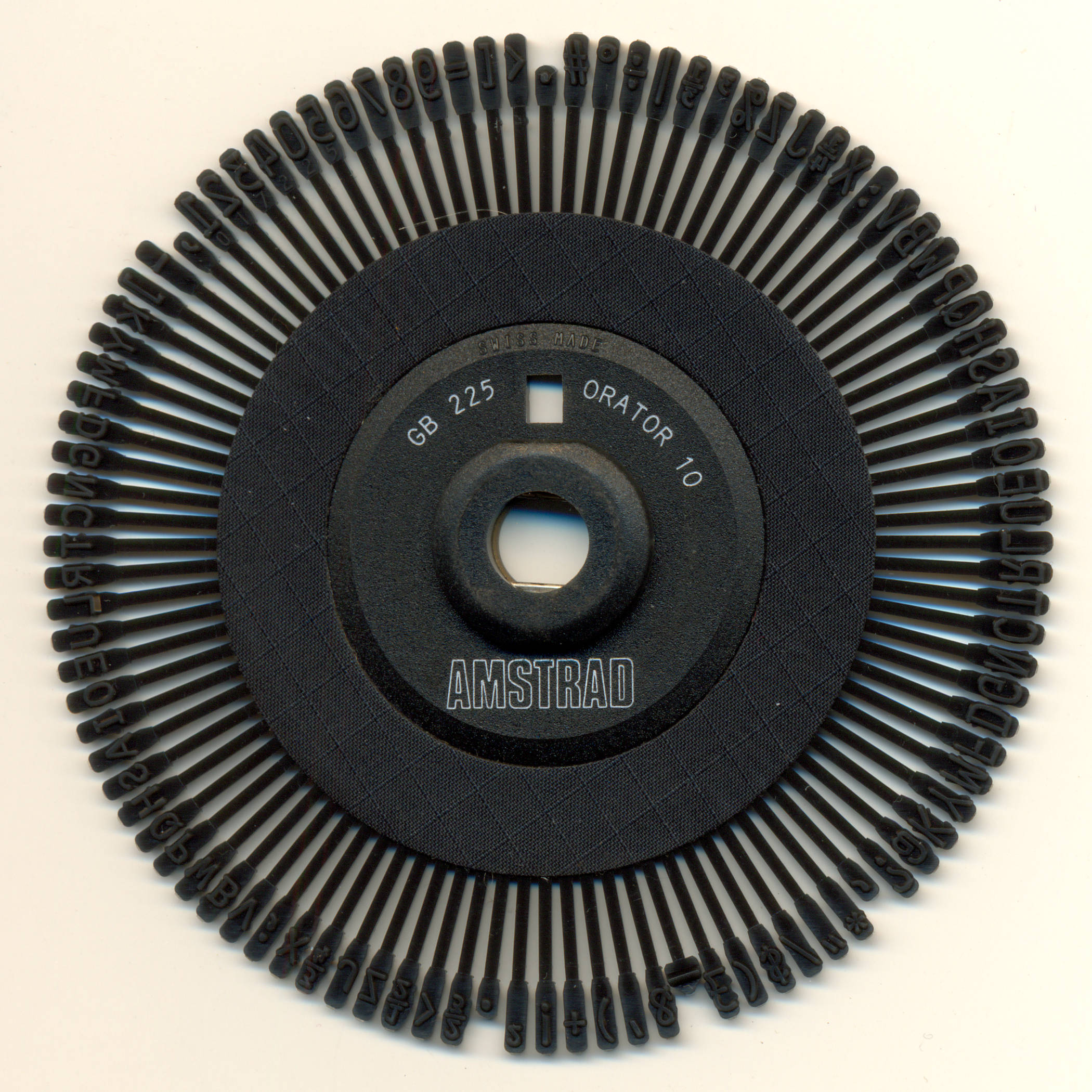
Orator 10
English
A commanding printwheel, with the curious distinction of having no lowercase letters, only smaller uppercase ones! This makes it very assertive, useful for official documents, forms, and other forceful statements. The computer equivalent of block capitals, it is a very appropriate typeface.
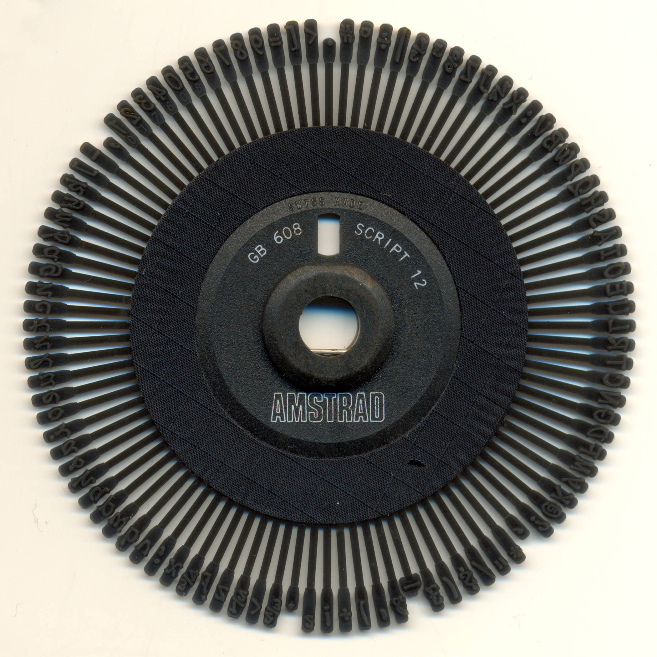
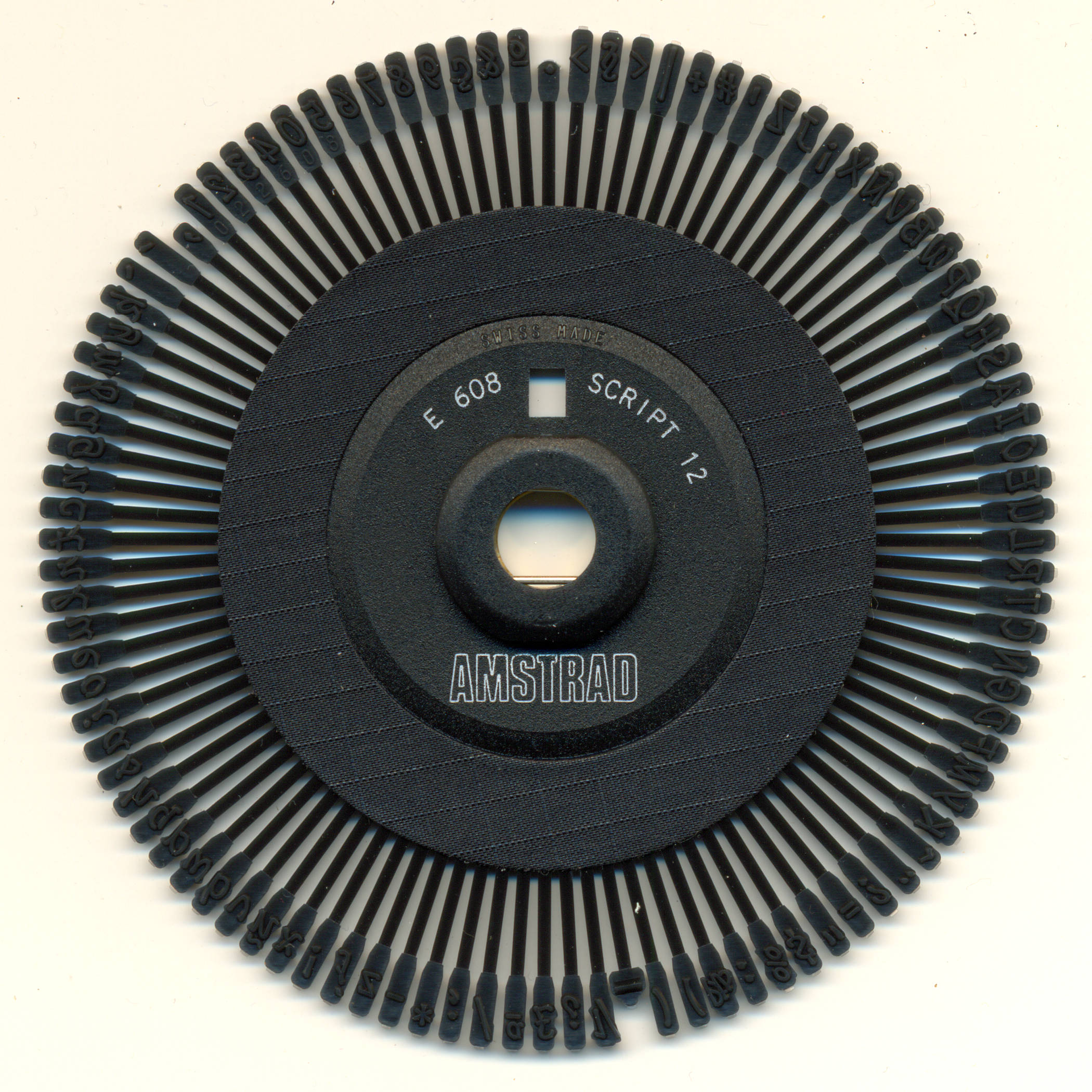
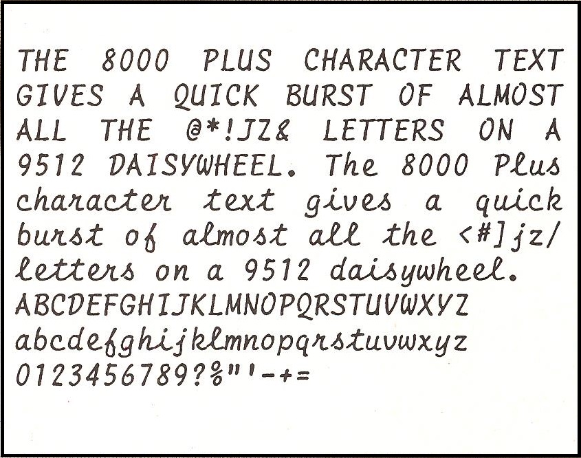
Script 12
English, Spanish
The cursive wheel for the 9512. A bit flowery for some people, perhaps, but it might be just right for you. It is not the script to use for writing abroad, due to the unfamiliar appearance of some characters, but it can add a nice variety for your friends and family. A pity that it is only available in pitch 12, not in pitch 10.
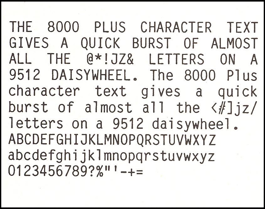
Letter Gothic 10/12
English
This is one of those wheels that can be used at 10 or 12 characters per inch, and still looks good. The picture shows pitch 12. The script style is quite simple, with no embellishments like serifs. Good for no-nonsense documents, like essays and theses, whichever pitch they are used in.
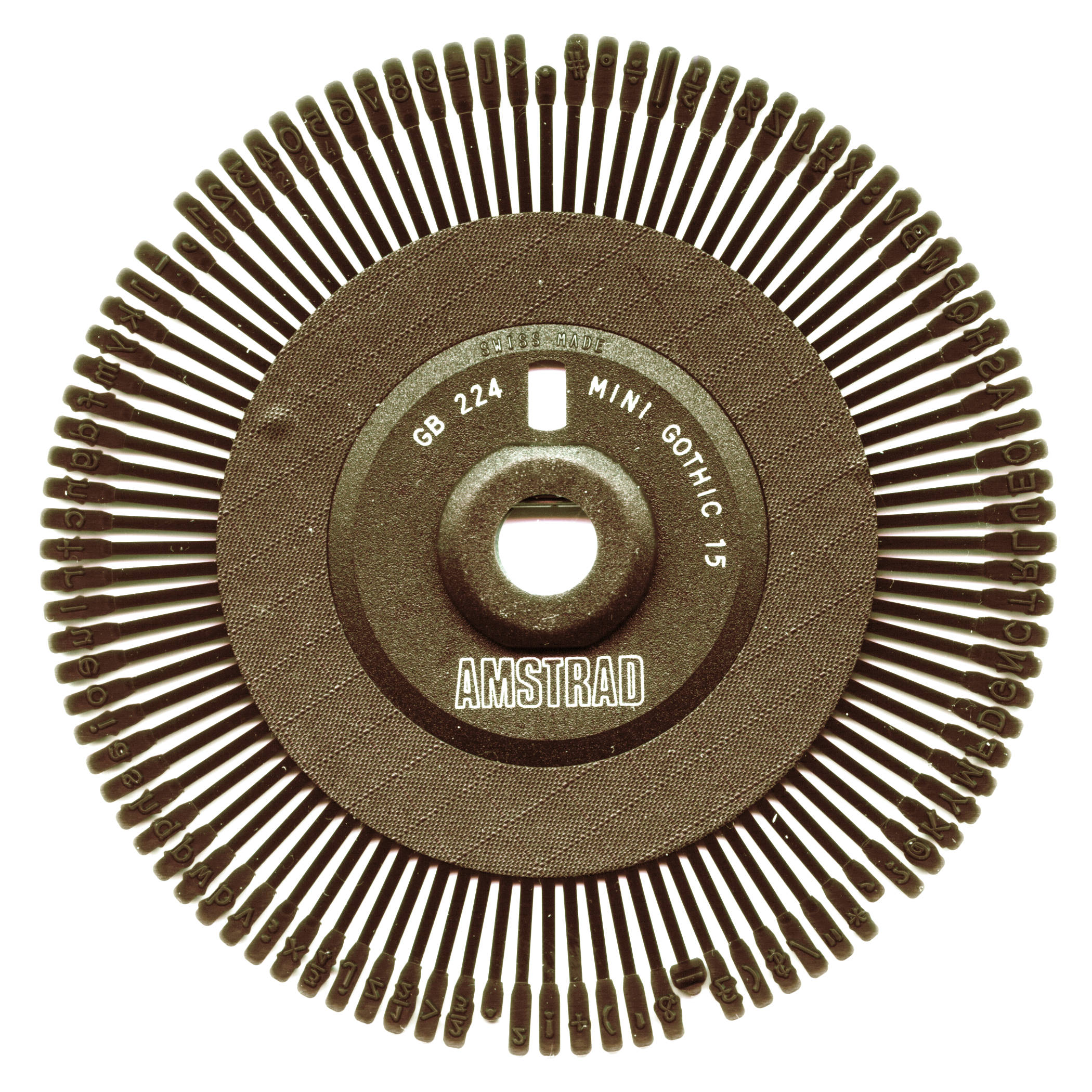
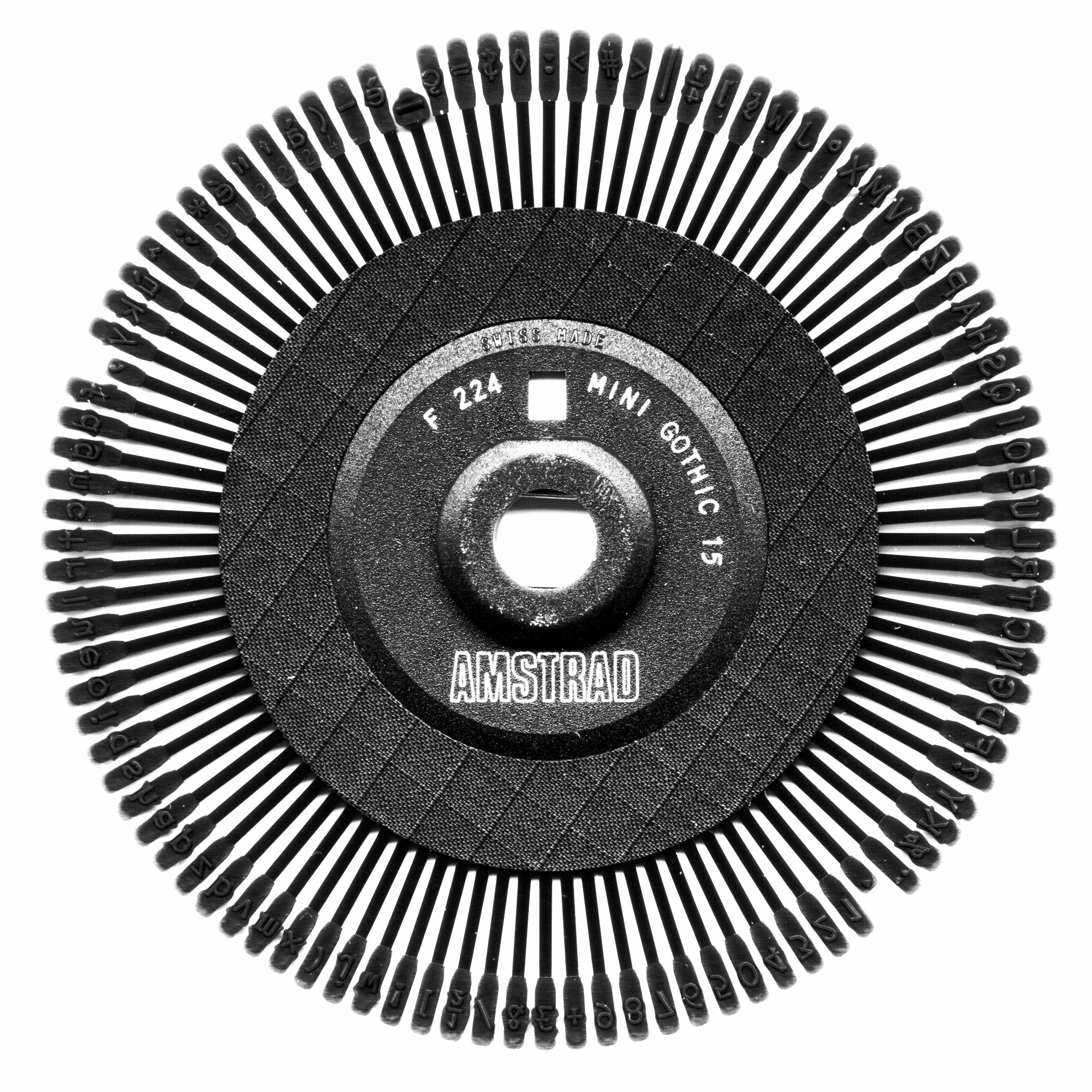
Mini Gothic 15
English
Belgian
The smallest typeface available, completing the range of the Gothic style across all pitches. As before, there are no serifs, which makes the text readable, despite its small size. Ideal for notes and memos on smaller size paper, it will inevitably look very dense and packed with characters on a large page. However, it is the ideal font for lawyers.
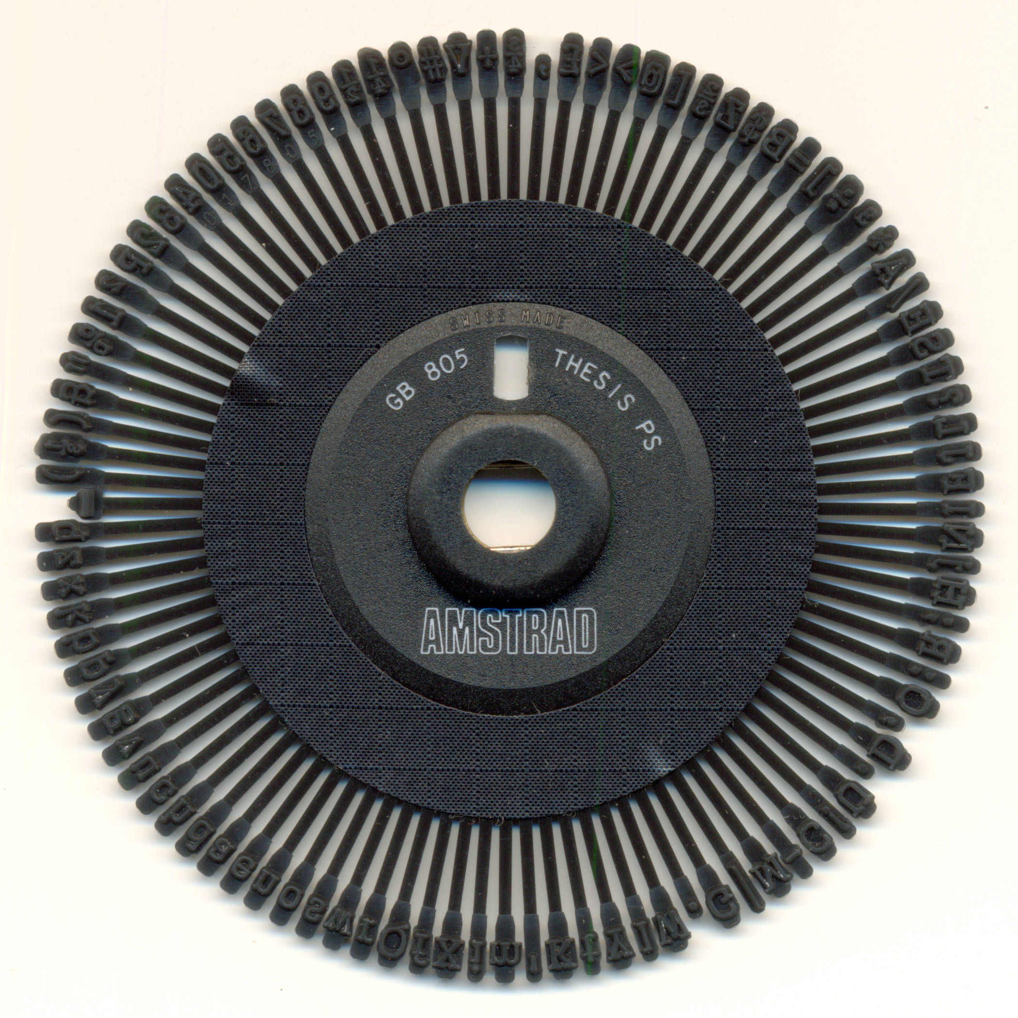
Thesis PS
English
PS stands for proportional spacing, meaning that each letter takes up space according to its size. Therefore, a "1" will take up less space than an "M" (notice how capitals take up space compared to lowercase letters). This is the way professional printers work, so the result looks very good and is sure to improve a corporate or academic image.
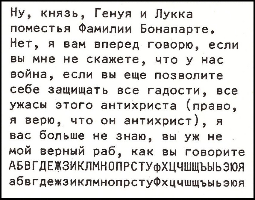
Russian Artisan 10/12
Russian
Another dual-pitch wheel, this is illustrated in pitch 12; it is, in fact, the only Russian wheel available. In addition to normal Cyrillic letters, there are several Ukrainian ones, along with Arabic numerals (except 1). The script is bold and remarkably clear, despite the complexities of the Russian alphabet.
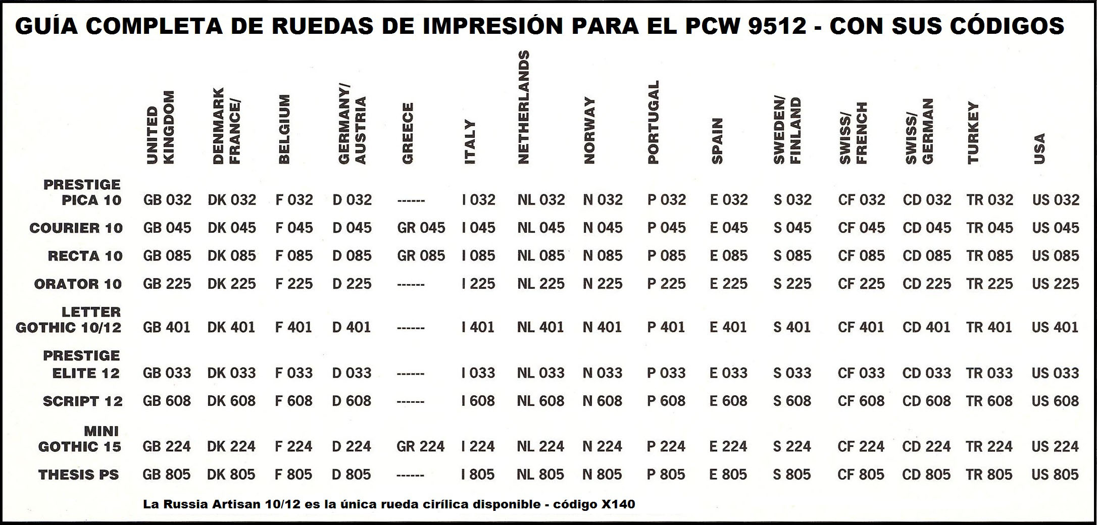
Complete printwheel guide
English suppliers stocked only English wheels; to obtain wheels in other languages, they had to be made to order. A single distributor named "WAVE Power" was known in Great Britain as the only one that stocked all typefaces, including the Russian one.
en/hardware/daisy_wheels.1778662274.txt.gz · Última modificación: por jesus